Simplicity is the essence of all good things and mobile apps are no exception. If your app has simple design, it will be easier to understand and use even for the novice users. It comes as no surprise that a simplified user interface and basic functionalities have emerged as the key factors that improve the chances for your app’s success. So why not understand what the users expect in terms of minimalism and replicate these expectations in your app’s design? Let us do it for you.
What is minimalistic- From A mobile app’s perspective!
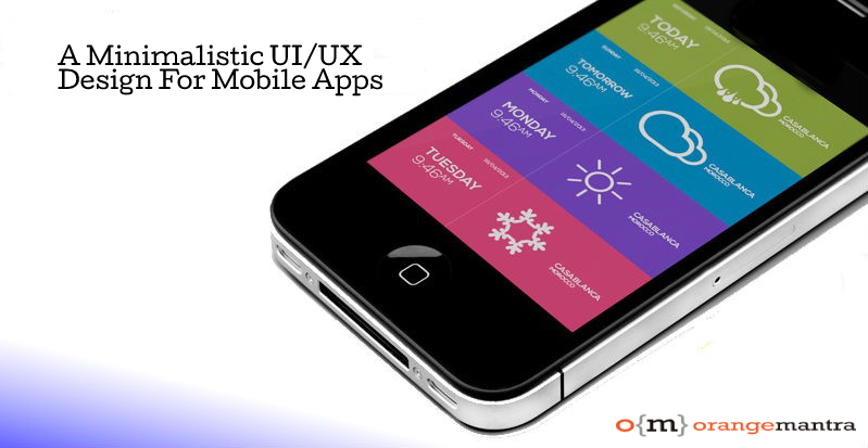
Minimalistic is a term that stems from the word minimalism. As the name suggests, a minimalistic design is the one that is simple, concise, consistent, and contains only the essential elements. It goes beyond the interface of the app and encompasses its functionality as well. Users, businesses, and mobile app developers appreciate the approach alike because it removes complexities from the app’s UI and makes it a breeze to use. Essentially, a minimalistic mobile app is simple to the core and offers a clear visual communication that enables the user to navigate it seamlessly. Here are some reasons that justify this approach.
- Offers an enhanced user experience for better engagement
- Ensures compatibility with different screen sizes
- Reduces the loading time of the app
- Improves app stickiness and user retention
- Maximizes the business ROI in the long run
Now that you probably know the advantages of investing in a minimalistic UI, you will be more than keen to embrace this trend. This may be apt if you are looking for a new app or want to reinvent the design of an existing one. Though the best approach is to avail professional UI/UX design services for the same, you still need to be aware of all that goes into creating a minimalistic design.
Essentials of a minimalistic UI design
Creating a minimalistic UI design is about finding the perfect harmony between form and function because it is the combination of UI and UX that get people to actually use it. Here are the elements that deserve attention in this respect.
Color schemes
The color scheme of your mobile app plays a vital role in making it eye-catching. For the sake of minimalism, stick to a simple yet sophisticated color scheme that gives a rich look to the app’s interface. Basically, there are two color scheme options for developers.
-
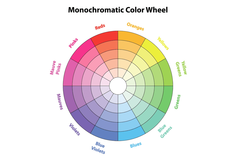
- Monochromatic scheme that involves the use of an array of shades, tones, and tints within a specific color. The brightness and the saturation points of the scheme can be changed to create different impact.
-
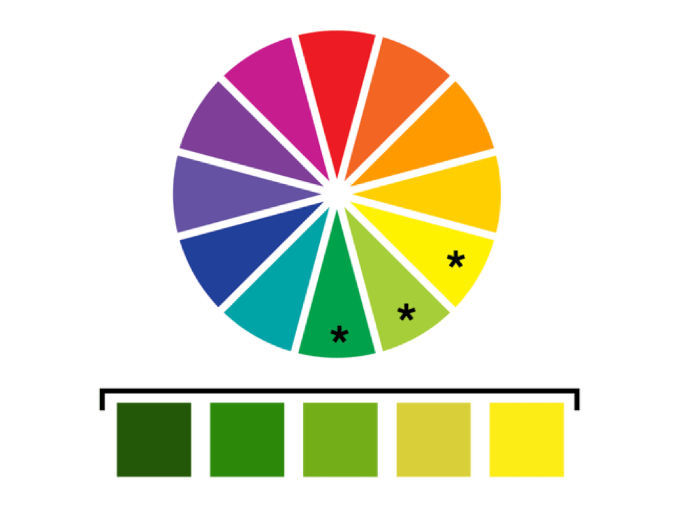
- Analogous schemes allows the designer to utilize three colors that lie adjacent to each other on a color wheel. The same colors are to be used for highlighting the design, with the brightest color being used for the most important elements and functions, while the lightest hue is reserved for the least important ones.
Typography
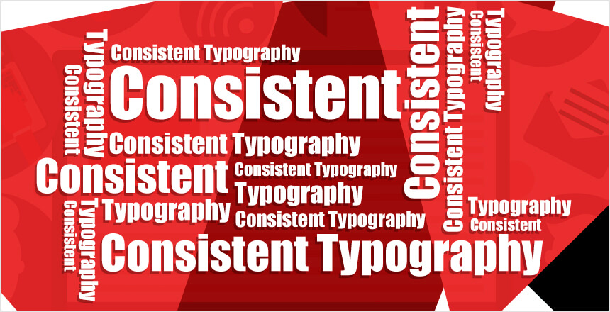
One app, one typeface is the rule of thumb when it comes to bringing minimalism is typography. Emphasize the same to the mobile app development company you choose because using multiple typefaces in your app can literally ruin the UX. There are certain rules that the designer needs to follow in this context.
- Judicious font selection is important as different fonts work for different content types.
- Font size matters as well because too small a font can degrade the visibility while one that is too large may occupy too much screen space and impact responsive views.
- Mixing multiple typefaces on the app can make the design appear inconsistent and sloppy.
- Choosing the right color contrasts for fonts and background is also essential for clear visibility and aesthetics.
Content and icons
An app’s content includes the textual information as well as certain visual elements such as the icons. Visual balance is the key and this is what a designer needs to focus on while incorporating these elements because the objective is to hold the user’s attention and retain it as well.
- Use limited content but convey clear message that is understandable and memorable.
- The icons should be clear, unified, and strategically placed to highlight the important parts of the app.
- Consistency is important while creating icons because their color, curves, and thickness need to be maintained.
- Keep the content and icons simple and uncluttered for the sake of visual appeal.
Use of white space
Also known as negative space, white space does not have any color, but is a critical component that plays a key role in adding structure, developing contrast, and highlighting the various design elements of the app. Basically, white space in design UI can be of four types.
- Text white space is the space between letters and lines
- Visual white space is that between images, icons, and graphics
- Content white space refers to the blank area that separates text and columns
- Layout white space is the space of margins and paddings
Special effects
Even though you may want to have a minimalistic design for your app, there are still some special effects that you may add to it. Whatever kind of effect you choose to have in the UI, ensure that it adds value to the UX rather than break or disturb it in any way. Some effects that can be used in minimalistic designs are as follows.
- Blur effect enables you to leverage the concept of layers and interface hierarchy for an enhanced visual experience.
- Data spotlight is a good option to emphasize an important piece of content by using a large font or bright visible color. Not much work but can get the user’s attention to key elements like CTA.
Conclusion
The app’s success rate greatly depends on compelling users designs that engage the users enough to stick with it as well as be back for more. A minimalistic design is the prevailing trend that gets you definite results. The focus, therefore, should be on building ones with these design specifications and also tweaking the existing apps to align with them. OrangeMantra is a name that you can trust for helping you in creating apps with the most amazing designs and functionalities. As a part of or mobile app and web design services, we offer custom interfaces for mobile apps and websites to match your requirements and the expectations of your target audience. Share your requirements with us and we will deliver a matching solution.
