A control panel, a dashboard for your sales platform in business software, provides important information at a glance. It keeps you informed of critical metrics and performance standards. Sales dashboards benefit sales management, operations, individual account executives, and other team members. For day-to-day operations, the majority of top salespeople rely on their sales dashboard solutions. Your metrics dashboard may differ from someone else’s on your team depending on your industry, type of sales (B2B or B2C), company size, and role.
Table of Contents
What is a Sales Dashboard?
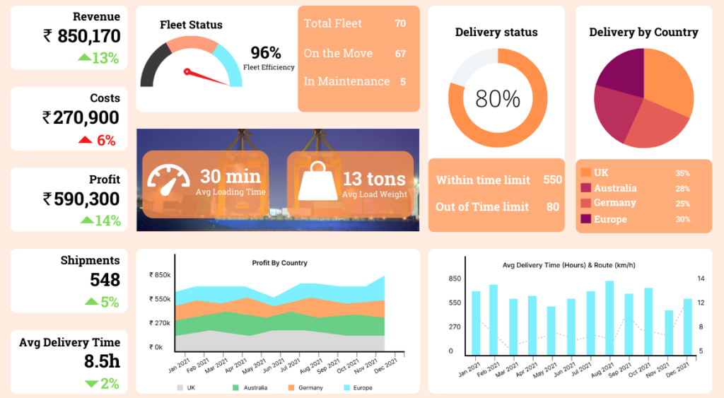
A dashboard is a piece of sales technology that visualizes your most recent performance metrics. It provides a clear picture of results-based data such as sales-to-date, sales-by-region, lead conversion rate, sales growth, and so on.
It also allows you to track activity-based metrics, such as calls made, emails sent, and the average lead response time to various outreach methods.
Dashboards are an essential tool for any company looking to increase revenue and set ambitious growth targets. Without a sales dashboard, you’re on your own to analyze massive amounts of data. Trying to manually compile all of those sales analytics metrics is an impossible task with critical human error.
Top Benefits of Using Sales Dashboards
In today’s data-driven world, having a reliable and simple way to assess your performance is the best way to go. You’ll waste a lot of time if you only rely on reports, and you might not even get the right information. For example, a sales representative may claim to spend five hours per day on the phone with prospects. They may not even be tracking their time accurately. A sales dashboard, on the other hand, is a piece of software that keeps everything in order and serves as a bottleneck for the correct information on how to increase your revenue. Here’s how a sales dashboard helps:
- Tracks the precise metrics across platforms
- Improves your sales performance
- Motivates your sales team to perform better
How to Create Custom Dashboards for Your Business
The dashboard solution creation process will be effective only if everything you do helps you connect with your target audience. Keep the audience in mind when telling a story and adjust your narrative accordingly. The same is true for creating a dashboard, which means that before you do anything else, you should outline your users’ needs.
A live dashboard for your stakeholders who want a monthly report, for example, will undoubtedly differ from an in-depth sales performance dashboard that your sales team needs to access on the fly. And if you want to create a dashboard to show your return on marketing investment (ROMI), your visualizations, design, and metrics will be very different from those in a marketing channel engagement report.
Define Your Dashboard Object and Audience
Sit down and spend some time answering the following six questions. Trust us when we say that any energy you put into your creative process will be richly rewarded later. The time and effort you put in to make it relevant to their lives and focused on the essentials will be greatly appreciated by those who will use it. Even if you’re just making this dashboard for yourself, the answers to the following questions will provide you with the foundation you need to make it truly valuable.
Ensure that the Data is Clean and Correct
After you’ve determined your target audience and objectives, it’s time to dig deeper into your data. This step is critical because it serves as the foundation for creating a dashboard that not only tells a story but also ensures that the story is correct and has the proper building blocks in place. You must determine where you will obtain the necessary data to achieve the objectives you have set for yourself. There are numerous data sources to consider, but they all depend on the business scenario you are working on.
Choose the Correct Chart Type for Your Data
How do you create a dashboard with the appropriate data visualization types for your KPIs? This is another critical question that cannot be avoided. Following is a quick overview of the most common types of charts and when to use each one:
Pie Charts: These charts are frequently the source of contention. According to data visualization guru Edward Tufte, “pie charts are bad, and the only thing worse than one pie chart is a lot of them.” Whatever your feelings are about pie charts, you should only use them when you need a graph that represents the proportions of a whole when the total of your numbers is 100%.
Bar Charts: The most common misunderstanding about charts is that more is better. Bar charts are a quick and easy way to visualize cohort analyses, comparisons, and trends.
Line Charts: A Line Chart is a useful graph that is made up of a series of data points connected by the eponymous line. They are frequently used to depict changes over time and identify trends.
Tables: Tables are ideal for displaying detailed information with multiple units of measurement that would be difficult to represent in a graph or chart.
Remember to Consider Colour Therapy
Approximately 8% of men and 0.5% of women are colour-blind. You should keep this in mind when choosing colors for the dashboard design. The vast majority of those classified as colour-blind will find it useful. This means they can perceive color but cannot differentiate between different shades of that color.
Sales Metrics You Must Include in the Dashboard
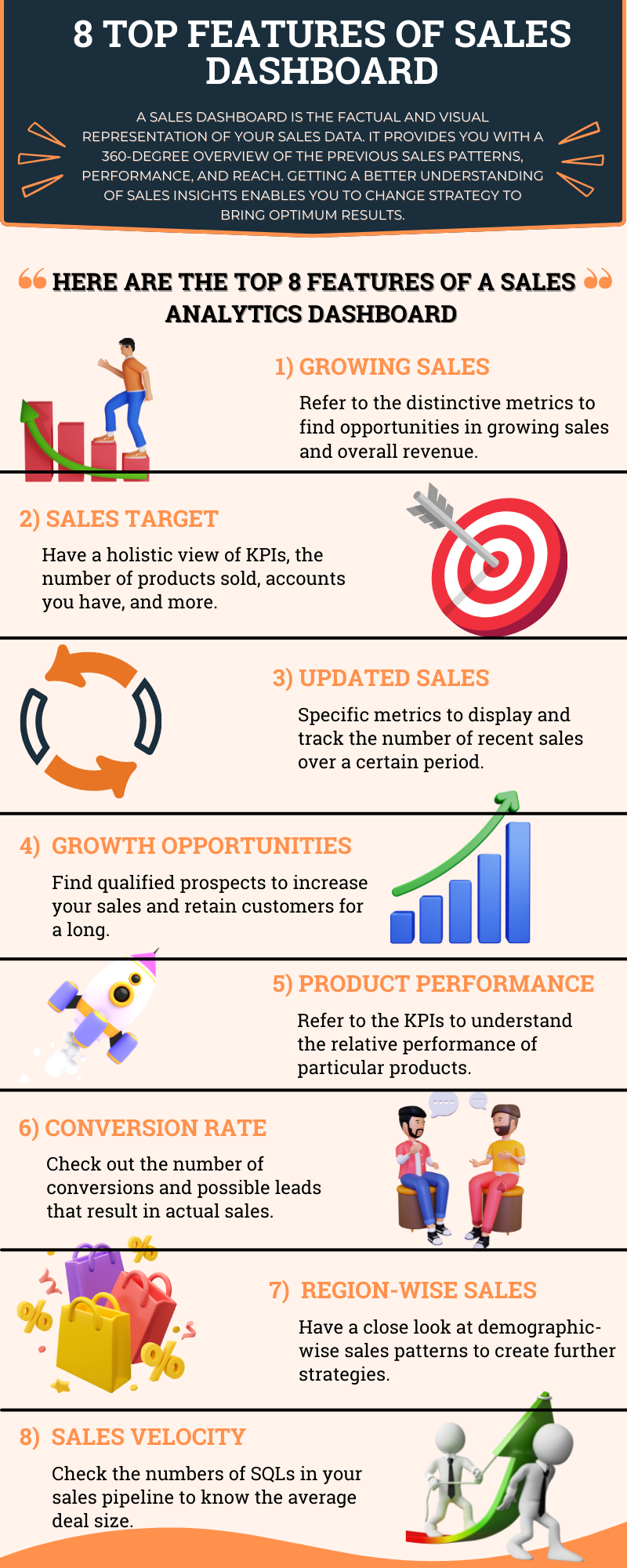
Dashboards are most effective when they provide an overview while also ensuring that you understand the details. A growing number of business execs agree that dashboarding is a must for success. Salespeople and sales managers must balance several big-picture metrics. A few factors of picture metrics include:
- Pipeline performance
- Individual salesperson performance
- Forecasts
- Product performance
- Your company’s competition
- Open activities
Consider these to be your task list. Your open activities are the tasks you must complete to remain proactive in your sales efforts. It’s great to have options, but if you have too many, review your schedule to see where your time could be better spent.
- Leads by source
You Learn about the sources of your customers’ complaints. Do the majority of your leads, for example, come from conferences, trade show booth meetings, website demo sign-ups, or referrals? This data allows you to prioritize which leads to contact first and focus on the most profitable sources. It also enables you to determine whether you need to diversify your lead sources so that you are not entirely reliant on one or two resources.
- Open opportunities
These are your bread and butter, and they influence your win or loss ratio. Use this to keep track of your leads and delegate when there are too many. When you want to increase the number of open opportunities in your pipeline, it’s time to expand your pipeline.
- Opportunities past due
Past-due opportunities occur, especially for salespeople who have too much on their plates (which is not uncommon). Your goal is to keep this as low as possible. Again, if this metric is growing faster than you’d like, consider delegating to others in your office. You can also track your funnel to find out why these opportunities aren’t closing and how to make it easier for leads to convert.
- Open cases
Usually, a customer’s first contact with a company opens a case. These and any other open activities should be considered time-sensitive. Take care to close these cases as soon as possible, as this may help improve customer retention.
Wrapping Up
Most salespeople get benefits from keeping close track of the metrics explained above. The key factor to a perfect sales dashboard is to consider your reports, your own sales goals, and what are expectations of your company are from your performance. This requires determining the exact metrics which is one of the crucial needs in current days.
A sales dashboard is the simplest way to stay organized and proactive in this hyper-competitive industry. Consider these metrics, investigate which data is most important to your success, examine dashboard samples, and then create your personalized dashboard. Your dashboard will assist you in closing deals faster as you work through your pipeline, both at your desk and on mobile devices.
FAQs
How do you do a sales dashboard?
- Determine which sales metric you want to track.
- Identify how will you use the dashboard.
- Pick a sales dashboard provider.
- Pull the data into the dashboard.
- Build your reports for the sales dashboard.
What are KPIs in the sales dashboard?
Sales KPIs are an important indicator of a company’s growth and are used to track the performance and overall effectiveness of various revenue-generating activities within a company.
What is a CRM dashboard?
CRM dashboards are interactive, it allows each team member to access the most important tracking data for the company on a single, shared platform. A well-designed CRM dashboard provides an overview of the most important data points related to the team’s mission-critical goals and key performance metrics (KPIs).


